





Higher conversion
Shorter paths and clear messages mean more sign-ups, enquiries and orders.
An interface where users know straight away what to click means fewer abandoned paths and fewer emails to support. We start UX/UI design with research and conversations with users. The look comes last.

Join the companies we design products for


Our offer
UX (user experience) decides whether users reach their goal without frustration: the paths, the order of steps and the content. UI (user interface) is the visible layer, meaning layout, typography and components. We design both at once. The most beautiful screen won't help if it leads to a dead end.
It starts with a UX audit or research: interviews with users, Google Analytics data, session recordings and a review against usability heuristics. After a few weeks we know where people get lost and which of those problems costs you the most.
Then come wireframes and a clickable prototype. We test it with real users before anyone writes a line of code, because a change in the prototype takes an hour of work and in a finished application a week. Finally, the UI design and a design system in Figma. Developers get components with all their states and descriptions, so they don't have to guess.
Scope of the service
Research
UX audit, interviews and data analysis
UX design
Information architecture, wireframes and prototype
UI design
Interface and design system in Figma
Outside the core scope
Application development (a separate service)
Who it's for
We work with companies where the interface directly affects sales, support costs or whether users come back.

The budget is limited and the feature list is long. Testing a prototype with five users quickly shows which features are really needed. You don't pay for the rest.

People sign up and disappear a week later. Usually onboarding or one key path is to blame. We find that spot and redesign it.

There is traffic but few sales. A UX audit shows the step where customers give up. Often it's a small detail in the cart or a form that costs a lot of orders.

A system employees dislike eats up a quarter of an hour here and there. Every day. We simplify forms and tables around the tasks people actually do.

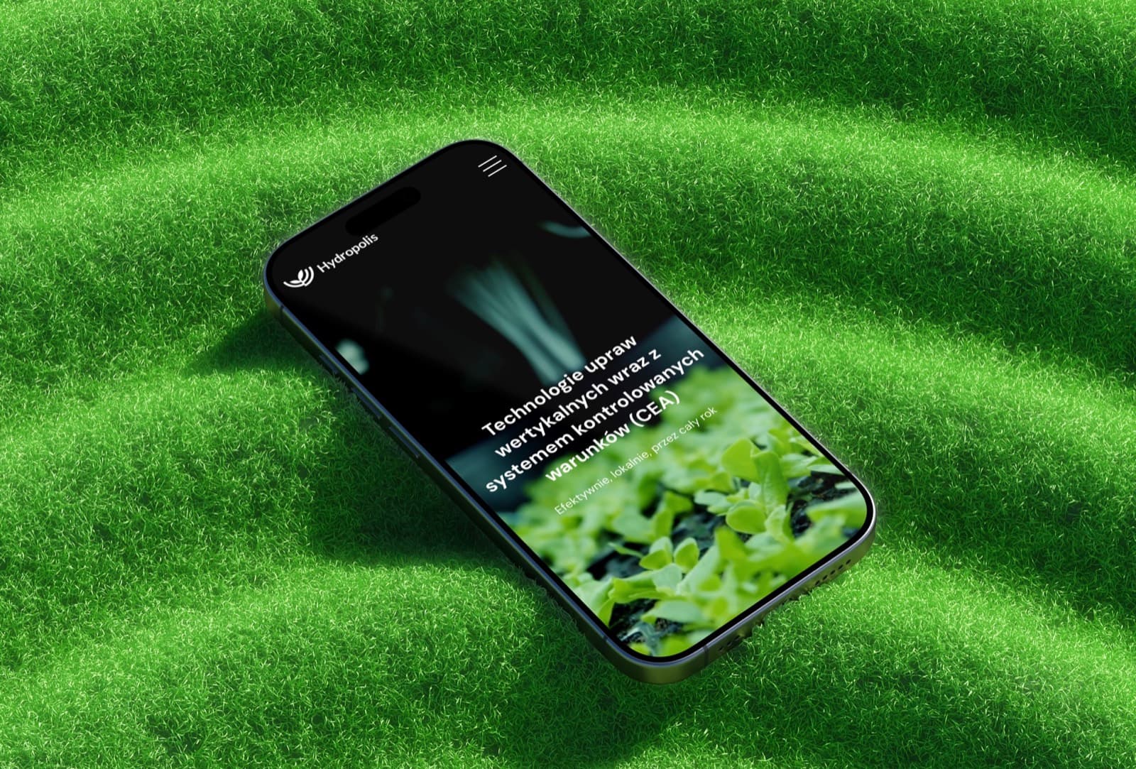
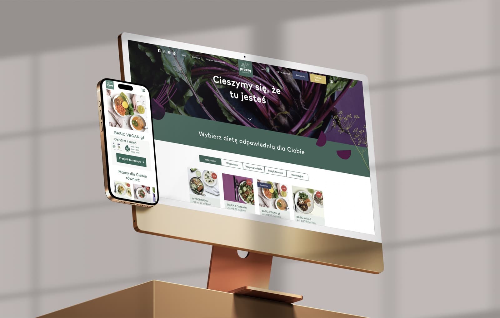
On a phone, what counts is the thumb and a few seconds of attention. Short paths, big buttons, sensible behaviour without a signal. That is how we designed the app for a vegan diet catering company.

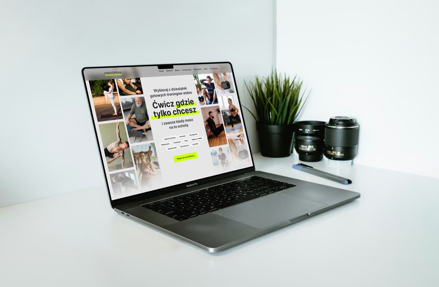
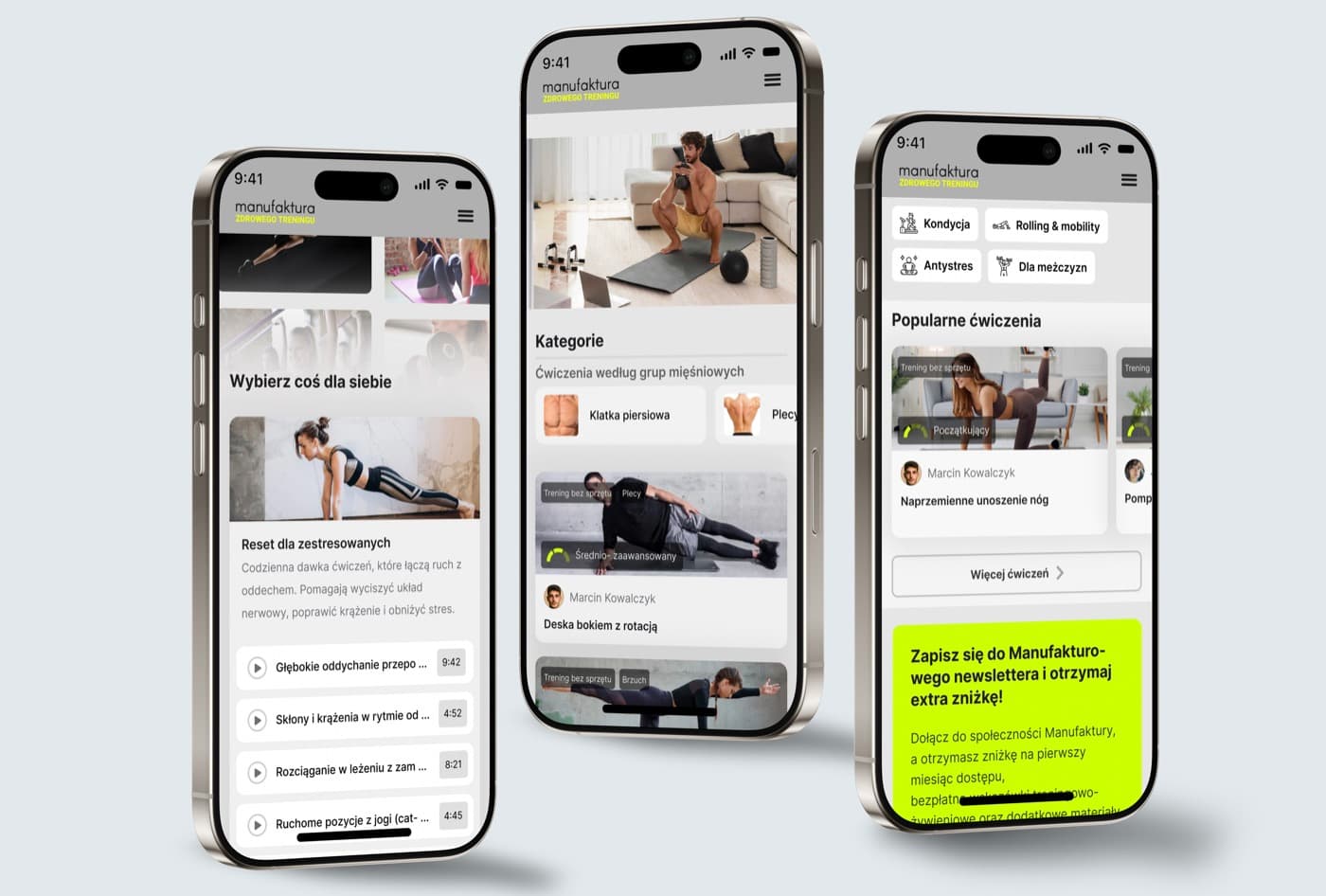
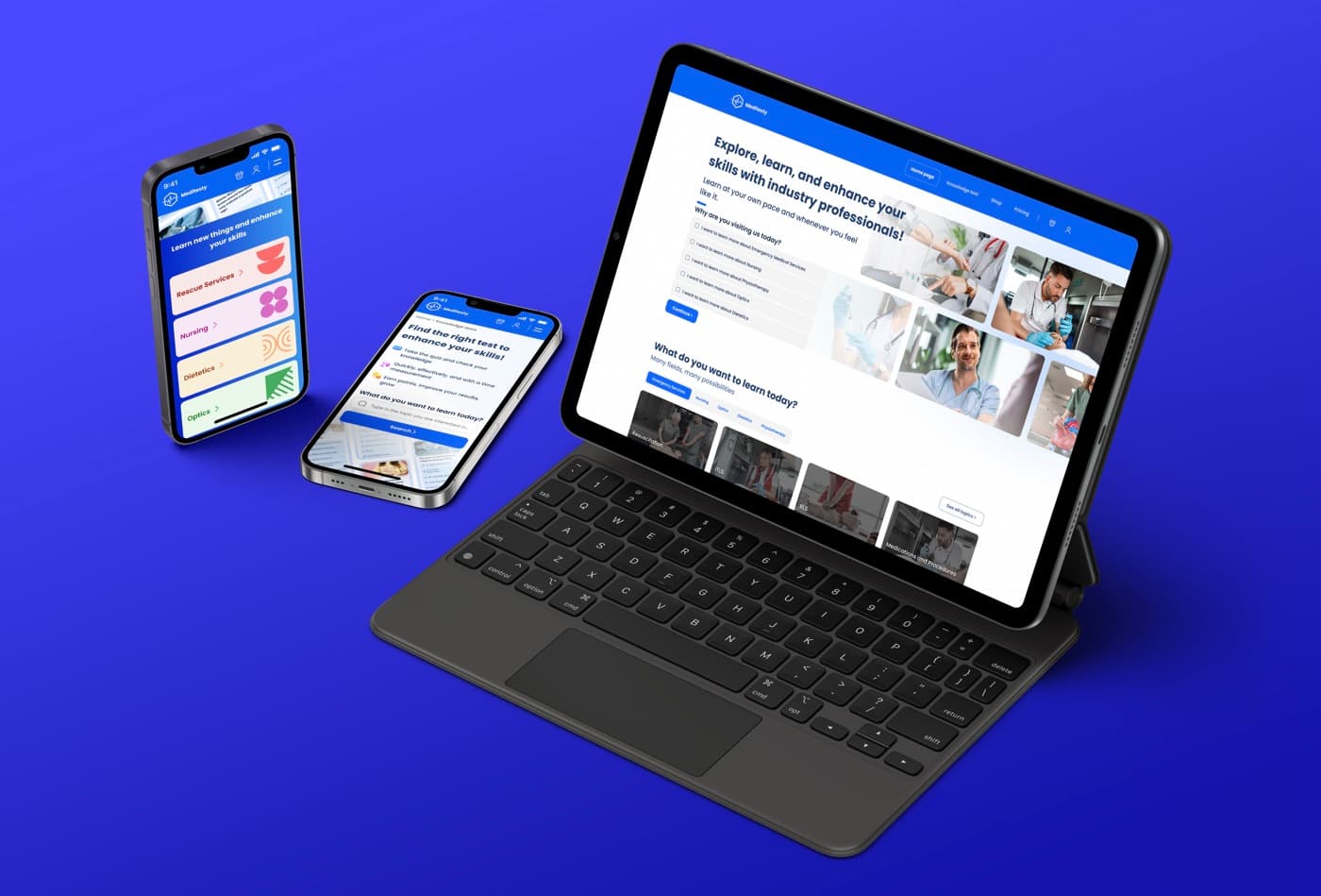
When someone is learning or looking after their health, the interface must not stress them out. We worked on an e-learning platform for future medical professionals and an online training platform.
What you get
Research-based design reduces risk. You know what you are building and why before you spend the budget on development.
Shorter paths and clear messages mean more sign-ups, enquiries and orders.
We catch mistakes in the prototype, not in code, where fixing them costs many times more.
A user who understands the interface writes to support less often.
A design system makes every new screen look and work like the rest.
Developers get components, states and descriptions, so they don't guess.
We design with WCAG in mind: contrast, readability, keyboard navigation.
Facts and figures
The business impact of design can be measured. Here are a few numbers from research.
+32
percentage points of faster revenue growth for companies in the top quartile of the McKinsey Design Index (McKinsey, 2018)
85%
of usability problems are found by a test with 5 people (Nielsen Norman Group)
10 s
is usually all you have to convince users that a page is worth staying on (Nielsen Norman Group, 2011)
75%
of users judge a company's credibility by the look of its website (Stanford Web Credibility Research)
How we work
Five stages. After each one you have a concrete result to review and approve.
Business goals and users
Who uses the product and why? How will you know the project has succeeded? We start with these questions. We also collect what you already have, such as analytics and customer feedback.

UX audit and interviews
A heuristic review, data analysis and a few user interviews. The result is a list of problems ordered by how much they cost the business.
Paths, wireframes, prototype
Information architecture and wireframes of the key screens, which we turn into a clickable prototype. User testing almost always overturns something, and that is exactly why we do it.

Interface and design system
The product gets a look that matches the brand. At the same time we build a design system in Figma, so every new screen stays consistent with the rest.
Supporting the development team
Developers get a design with descriptions, and we stay on call during the build. After launch we check that the product works the way we designed it.
FAQ
Answers to the questions we hear most often before a project starts.
